Onboard V3: From crypto wallet to global money app
In summer 2025, we launched Onboard V3: one app to hold, send, receive and spend dollars, local currencies and stablecoins.
I led the redesign that turned four separate tools (a USD account, a stablecoin wallet, virtual cards and cross-border payments) into one money app. We migrated 10,000 users to V3. In the launch quarter, monetisable volume nearly doubled and revenue per transacting user grew 38%.

Due to non-disclosure agreements, I've left out confidential information. Figures are shown as relative change.
The backstory
Why V3 had to happen
Onboard started as a self-custody crypto wallet for DeFi-native users. Its stablecoin payments were taking off in emerging markets, where holding dollars is hard and sending money abroad is slow and expensive.
But the people who needed it most weren't crypto people. Every product we added (a USD account, virtual cards, trading, cross-border payments) arrived as its own island, with its own balance, its own send flow and its own rules.
At the start of 2025, the company went all in on a new direction: from an onchain protocol to a simpler, regulated money app for a broader market. Internally we called it Project Unity. The goal was to bring everything we'd built into one coherent product, so we could:
- make moving money cheaper and faster than existing global rails
- double our monetisation rate
- grow acquisition
- be seen as a money app, not a crypto app
 The V3 core: one home, one send flow, one place for every account
The problem
- Crypto fluency was a requirement. V0–V2 were onchain-first: networks, gas fees and wallet addresses showed up in everyday tasks.
- Only about 1 in 8 new users activated. Most people signed up, looked around and never moved money.
- Sending money worked differently in every product. Four products meant four send flows, four ways to check a fee, and no single place to see whether money had arrived.
- Power users depended on that complexity. Any simplification risked losing the crypto-native users who'd made Onboard work in the first place.
The goals
- Make Onboard usable without crypto knowledge. Measured by KYC start rate and activation rate.
- One clear way to move money, from any balance. Measured by monetisable volume and transactions per user.
- Double monetisation. Measured by revenue per transacting user.
- Don't lose existing users during migration. Measured by month-on-month retention of transacting users.
My role
What I owned
As Design Lead, I owned V3's information architecture, interaction design and UI, from first concept to launch. I worked with a PM, five engineers, a data analyst, an illustrator and compliance.
I led
- The new information architecture: how every balance, product and action fits in one app
- End-to-end design of the core money flows: add, move, send and track
- Usability testing: I co-ran moderated sessions with 9 high-value users on two competing prototypes
- The growth surfaces: refer-and-earn and a time-boxed setup reward
I collaborated on
- Merging four regulated products, each with its own technical and compliance limits, into one model (with product, engineering and compliance)
- Defining success metrics with data
 The new home: one total balance, every account one swipe away
Process
How we worked
1. Sprint. A one-week design sprint to rethink the core experience from first principles: what Onboard is for, and how every product should fit together.
2. Prototypes. I built interactive Figma prototypes for every core journey: onboarding, the dashboard (two competing versions), exploring accounts, and six ways to move money, from USD-to-bank to bank-to-crypto-wallet.
3. Testing while engineering built. The backend took months, so we didn't wait. Over one week, Henry (PM) and I ran moderated remote tests with 9 high-value transacting users, measuring task success, time and satisfaction for each journey.
4. Handoff. Annotated flows covered every state, including empty, pending, failed and refunded.
Each decision below shows what testing changed.
Decision 1
Organise around money, not technology
V2 was built crypto-first: every action on home (Add, Transfer, Swap) and every prompt beneath them led to crypto, with the card stacked on top as a secondary account. To become a money app, cash had to be the centre, not another card in the stack. So home had to follow how people actually think: my money, and what I want to do with it.
The ambition went beyond a redesign. With Project Unity, Onboard was becoming a regulated money app for a broader market: one place to hold, spend and move money, with crypto there for those who want it. If people were going to trust us with all of that, home couldn't feel like a toolbox. That set up the question:
How might we make Onboard the last finance app you'd ever download, without front-loading every money tool at once?
Our answer was to rebuild the app around three groups:
- Cash. Everyday balances like USD and EUR
- Cards. Virtual cards for spending and subscriptions
- Crypto. Trading and the self-custody DeFi wallet, still there for those who want it
Home shows one total balance, with each account a swipe away and two actions up front: Add money and Send money. Send sits at the centre of the bottom nav, always one tap away.
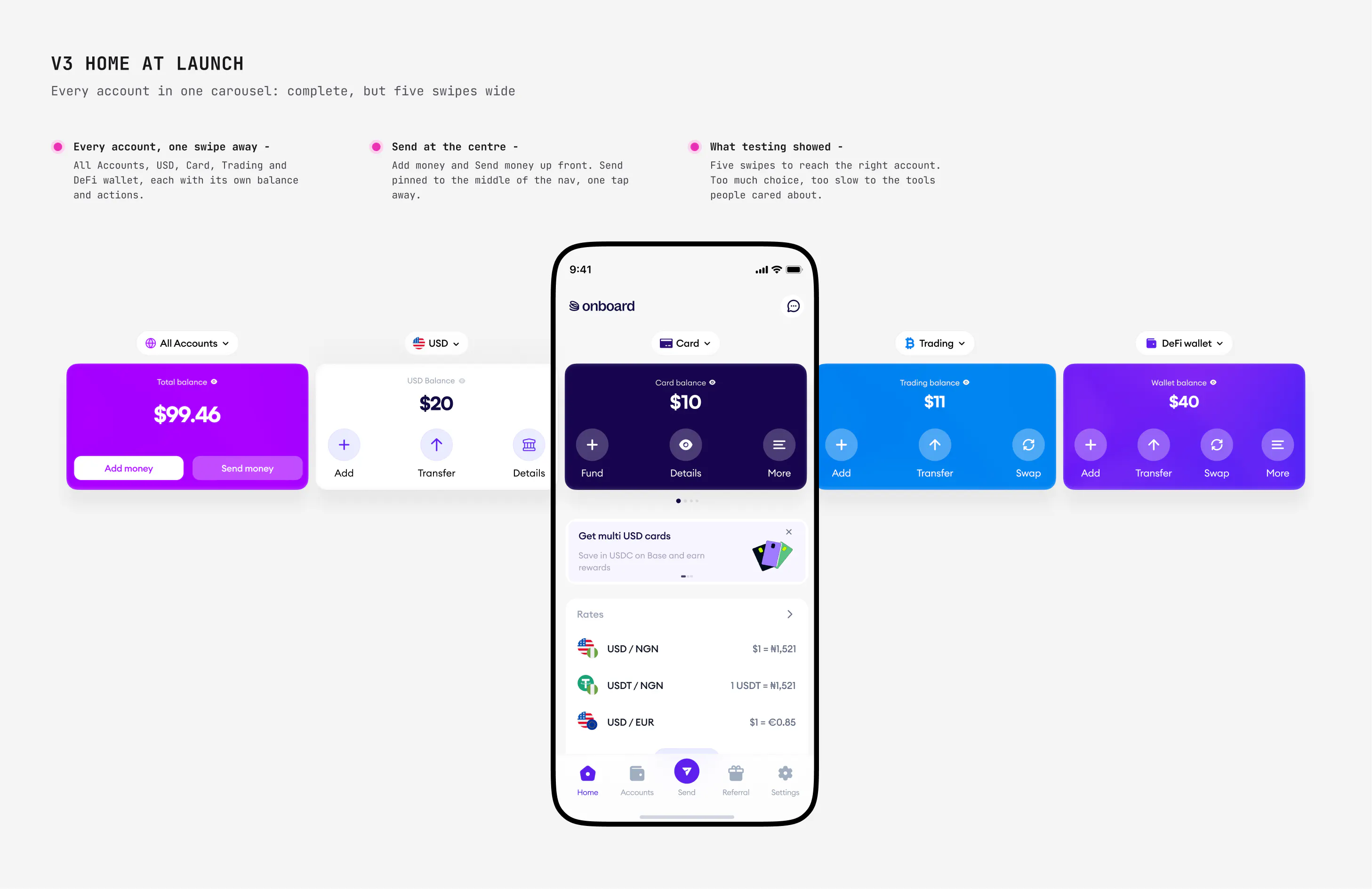 V3 home at launch: every account in one carousel, five swipes wide
What testing changed
V3.1: from complete to focused
V3's home was comprehensive: every account a swipe away, each with its own set of tools. That turned out to be the problem. Swiping through five accounts gave people too many choices, and we weren't getting them to the tools they cared about fast enough. Most of the time, people aren't thinking about where they put their money. They just know they have it.
We had designed for completeness when people needed focus. V3.1 gave home a sharp one: cash. Home now shows what you have and what you can spend, with Card and Crypto in their own tabs, so people can get straight on with the task in hand. Cash is also our preferred path to activation, because it's where Onboard monetises, so focusing home on it pointed new users at the actions that matter most.
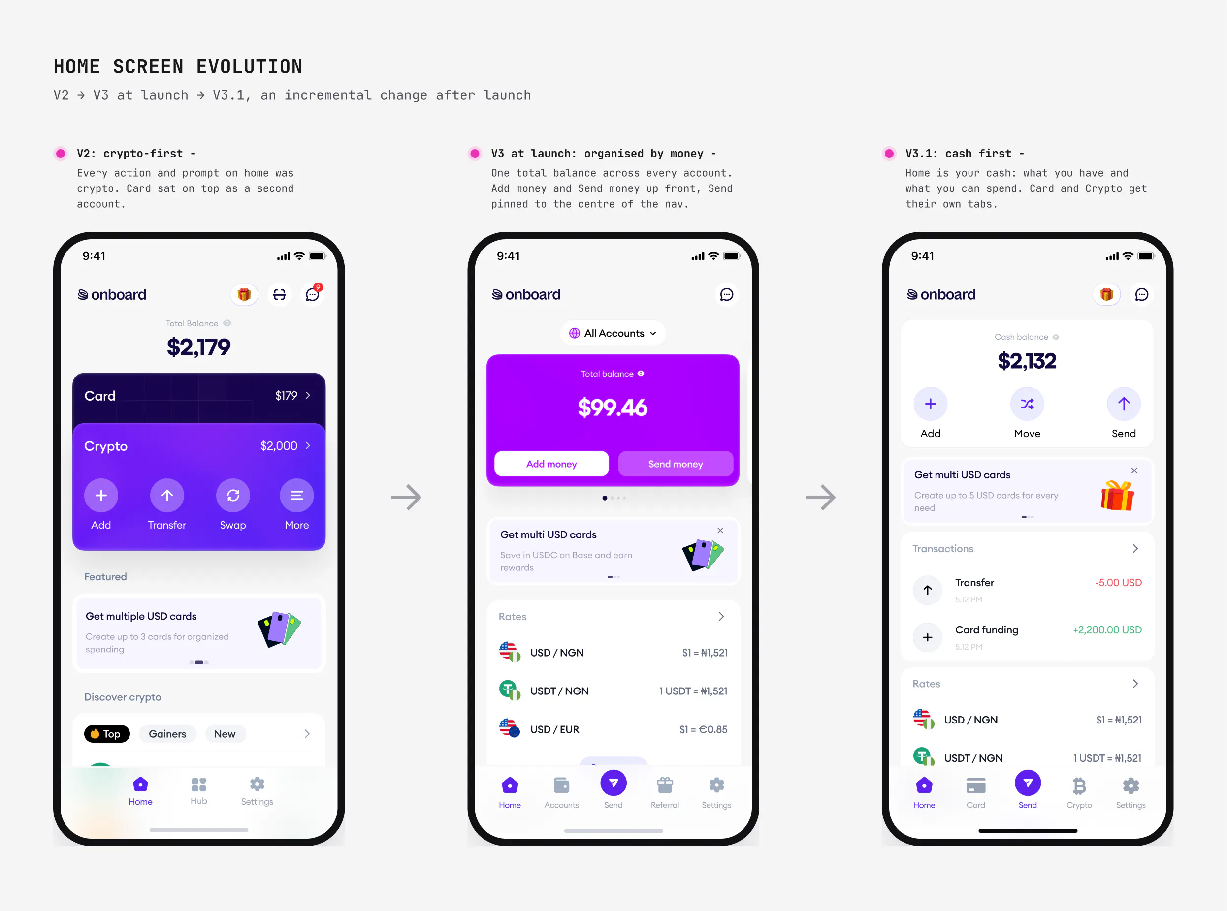 How home evolved: V2 crypto-first, V3 organised by money, V3.1 cash first
Decision 2: the core flow
One send flow for every kind of money
In V2, every product had its own send flow. In V3 there's one. You pick where the money is going, and the app chooses the rails behind the scenes: bank transfer, mobile money or stablecoin.
That first choice came straight from testing. Our early prototype grouped send options by asset type, and "Send from any cash account" was misunderstood by almost every participant. So we grouped by destination instead.
The flow at launch (sending dollars to a bank account in Kenya)
- Send. One question: To bank or mobile money, or To a crypto wallet?
- Send from. Defaults to your USD balance. Change lets you pick another.
- Amount. As you type, you see the fee (often free), the total we'll convert, the rate, what the recipient gets in KES, and "Arrives in 10 mins".
- Recipient. Pick a saved recipient or add a new one.
- Review. Bank, account number and an expandable cost breakdown, before anything moves.
- Sent. "We'll notify you when this transaction is completed."
Then we reordered it. In testing, every participant expected to choose who they're paying before how much, the way a bank works. V3 launched with the amount first. In a later release we moved the recipient to the start: recipient → amount → review → confirm.
We also renamed vague buttons. Participants read "Continue" as "Send now" and hesitated, so each step's button says what happens next: Next → Review → Confirm.
The principle: no surprises. The cost, the rate and the arrival time all show up before you commit, and so do your transfer limits, because unclear limits made cross-border users nervous in testing.
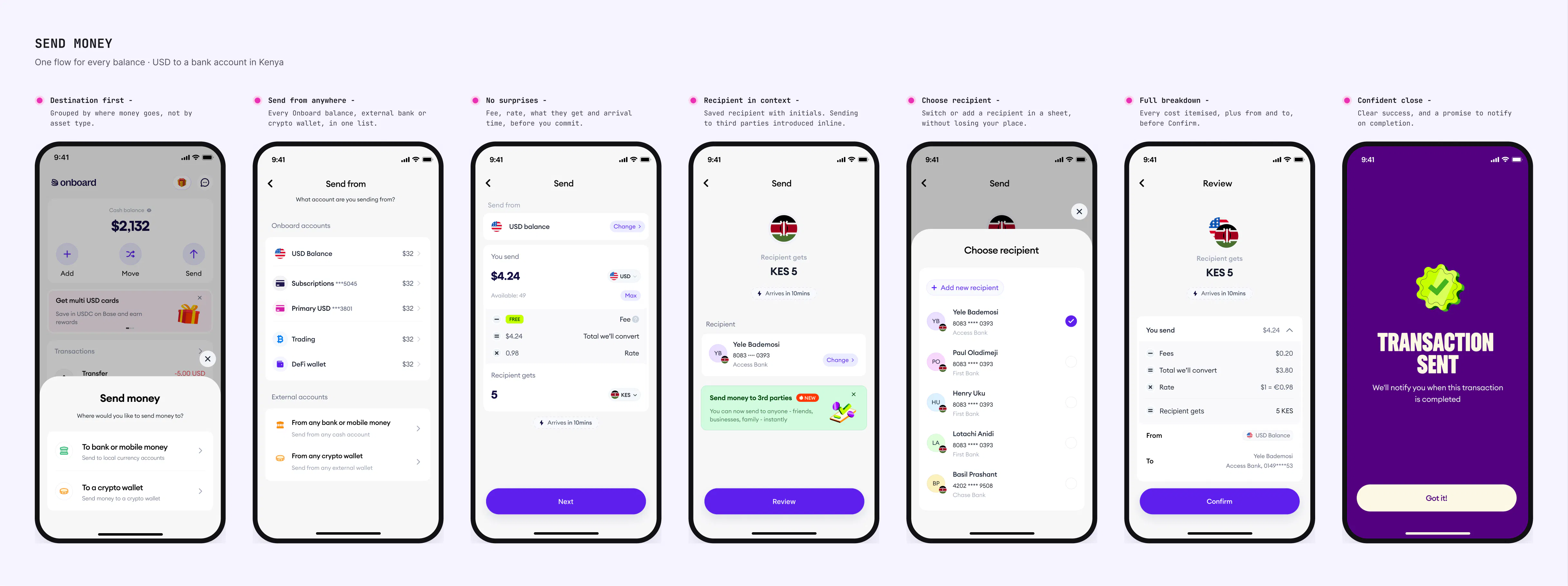 One send flow for every balance, from choosing where the money goes to a confident close
After you press send
Cross-border money takes minutes, not milliseconds, and the gap between "sent" and "arrived" is where trust breaks. So every transfer gets a live tracker:
- Home shows an Ongoing transaction card. Tap it to track.
- The receipt is a three-step timeline: Cash sent → Conversion ongoing → Funds received.
- If something goes wrong, the fix is on the same screen. A failed payment offers Retry. One we can't process offers Refund, and the status updates once it's refunded.
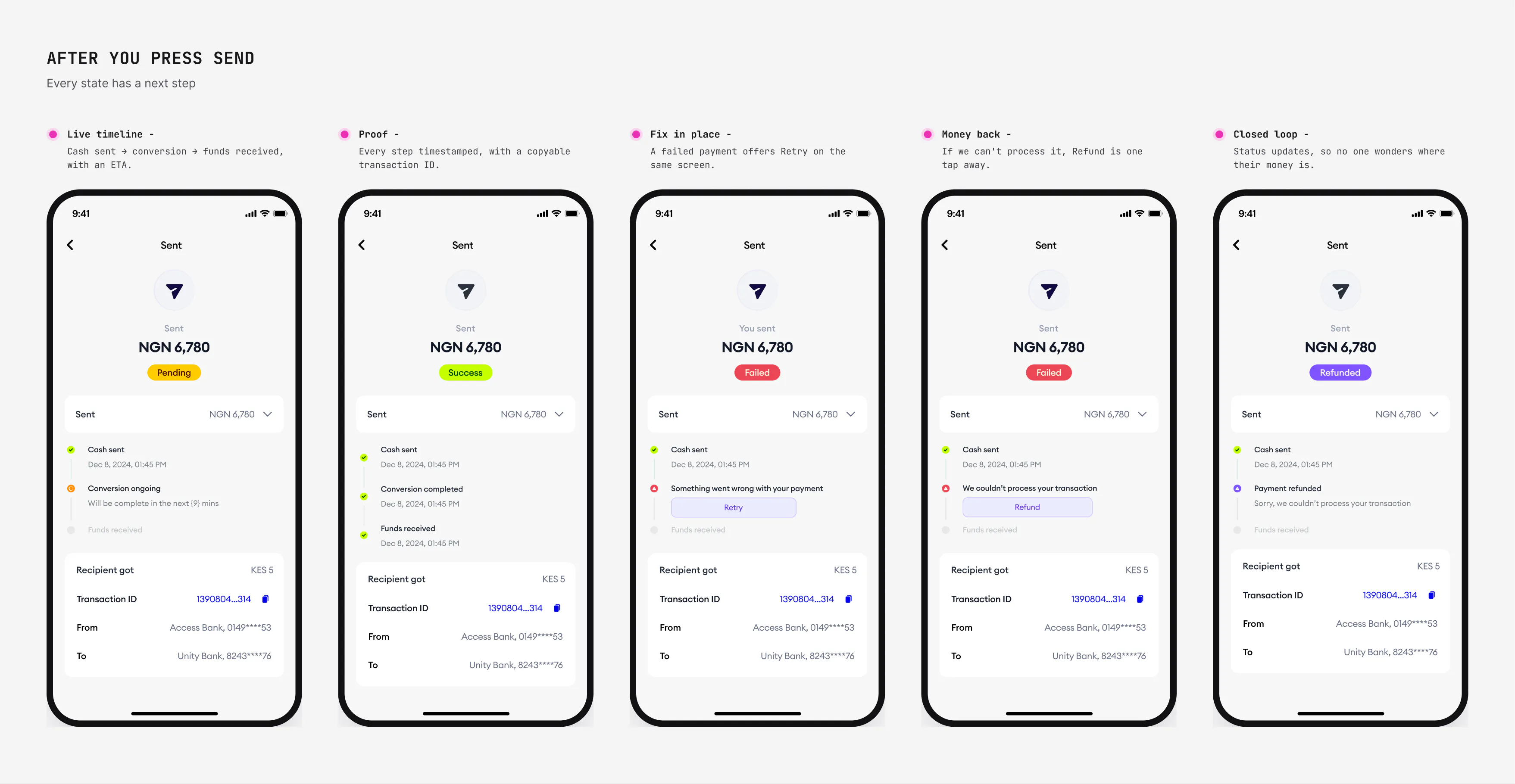 Every state has a next step: pending, success, retry, refund, refunded
Decision 3: activation
From sign-up to active user
Activation was our weakest number: only about 1 in 8 new users ever moved money. Signing up was easy. The steps after it (verifying, funding, spending) were where people stalled. So I designed activation into the product itself.
Finish setup in time, get $20
A time-boxed checklist that turns three scattered first steps into one goal: verify your identity, add $100, and make three card purchases of $20, before the deadline, and get $20.
- It lives on home. A setup card with a live countdown shows the next step and a Start button, so the first thing a new user sees is what to do next.
- It gets out of the way. In testing, people disliked cards they couldn't clear, so the checklist can be dismissed.
- Every step has one action. Each item carries its own button (Verify me, Add money, Open cards), so no one has to hunt for where to go.
- Waiting is a state, not a dead end. While KYC is processing, the step says View details instead of Start, and the screen sets expectations: usually under 15 minutes.
- Failure is recoverable. If verification fails, people see why, how many retries are left, and tips to pass next time.
- Progress is visible. Steps tick off on a timeline, and the reward card says exactly when the $20 is paid.
- Only real spending counts. Purchases must be $20 or more, and cash-like transactions (gambling, gift cards, transfers) don't count, so the reward drives genuine use.
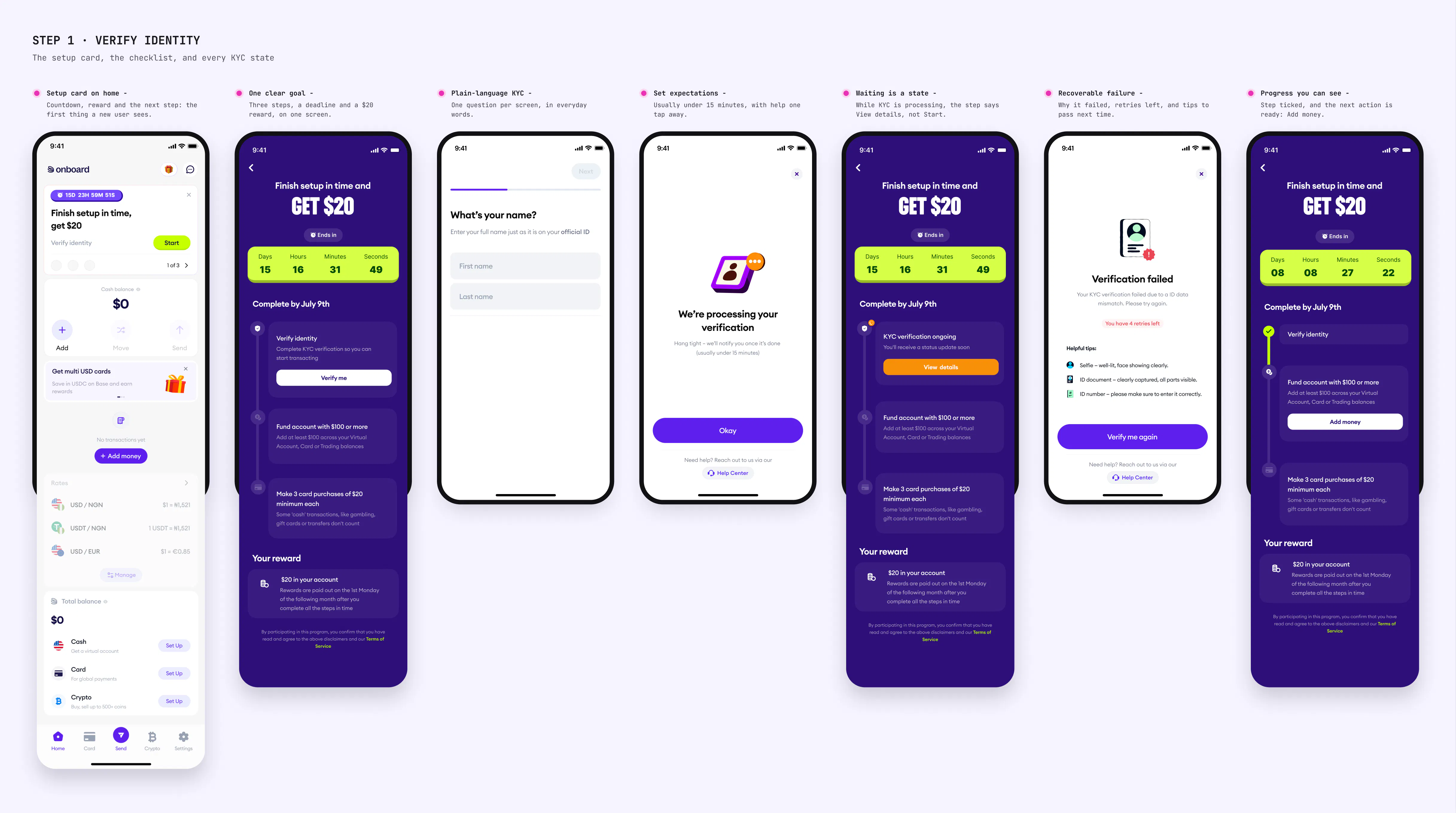 Step 1, verify identity: the setup card, the checklist, and every KYC state
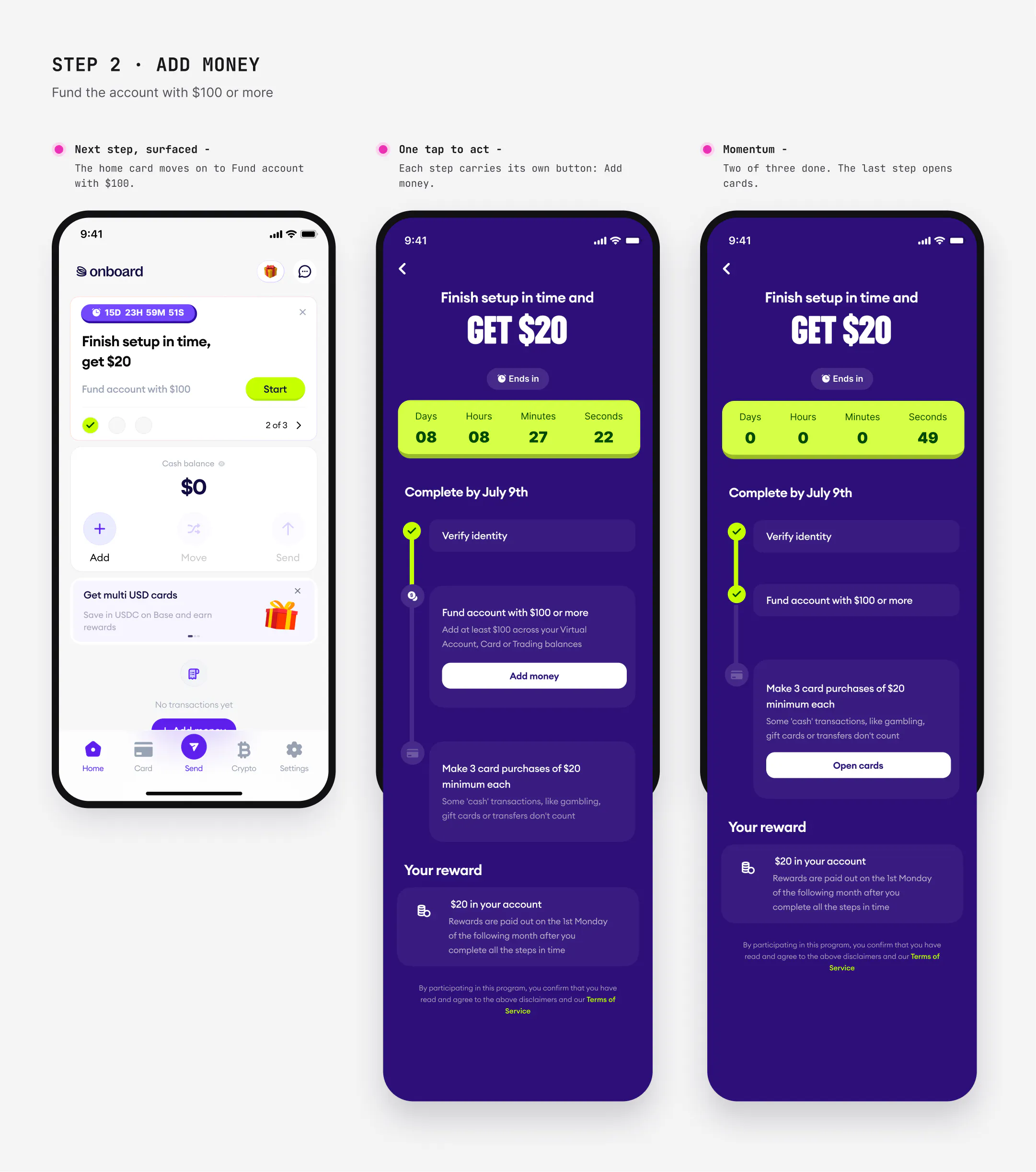 Step 2, add money: the next step surfaced on home and in the checklist
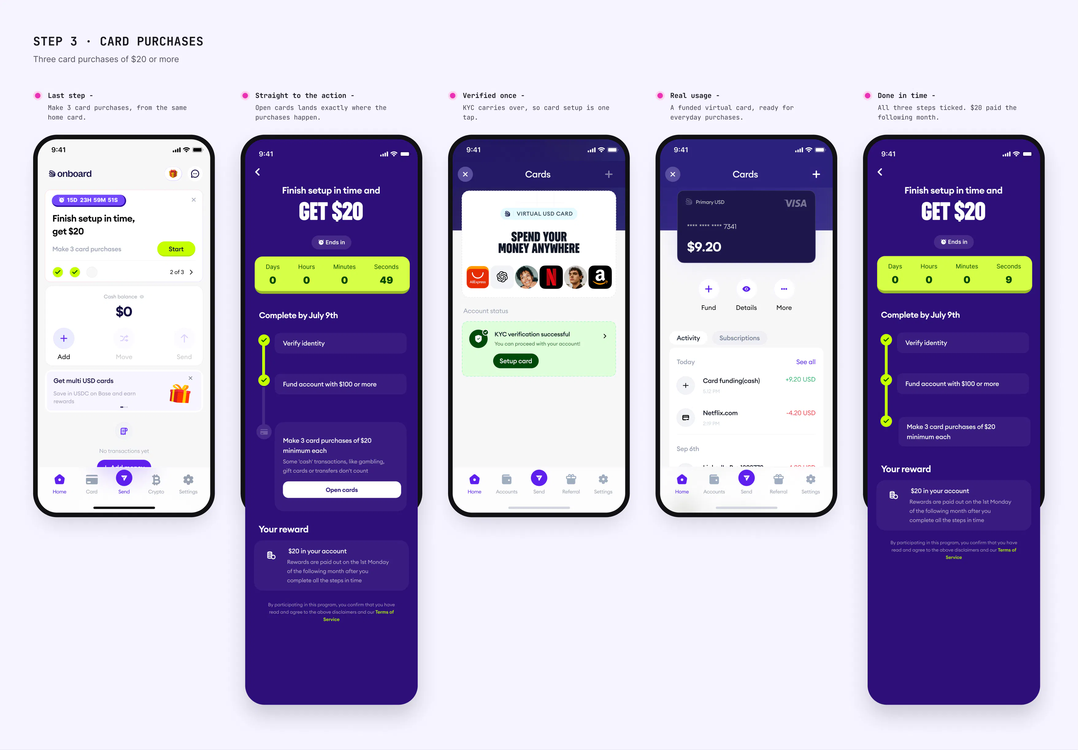 Step 3, card purchases: straight to cards, and all three steps done in time
Refer and earn carries the same idea into growth: $10 for each friend, paid once they spend up to $100 on their USD card, so referrals reward active users, not empty sign-ups.
What changed: in the months after the checklist launched, the share of new users starting verification rose from 37% (June) to 54% (September), and reached 74% by January 2026. Activation rose from 11% to 13.6% in Q4.
 Activation built into the core: the setup reward, refer-and-earn, and instant account details
What didn't work (at first)
Our power users pushed back
The single send flow broke the habits of our crypto-native users. They relied on legacy rails like Direct accounts, which we'd deliberately moved deeper into the app to keep the default clean. To them, it felt like we'd traded power for ease.
What we did: instead of rolling back the unified flow, I brought their favourite workflows and tools back inside the Crypto tab. Power users got their shortcuts back where they already expected crypto to live. Everyone else kept the simple, unified experience, untouched.
What I learned: simplifying for the majority is half the job. The other half is giving experts a short, findable way back to the control they rely on.
~2×
Monetisable volume, in the quarter V3 launched
+38%
Monthly revenue per transacting user
37% → 54%
Users starting verification (KYC), in 3 months
Impact
The launch quarter (Q2 → Q3 2025)
We migrated 10,000 users to V3. Compared with the quarter before:
- Monetisable volume nearly doubled (+84%)
- Revenue grew 70%
- Revenue per transacting user grew 38%
- Users starting KYC rose from 37% to 54% (June → September). It reached 74% by January 2026
- Monthly active users grew 24%, and transacting users 27%
- Transactions per user rose from 5.2 to 5.7 a month
- Retention held steady at ~57% month-on-month, through a full migration of the user base
Reflection
What V3 taught me
- Organise around what people are trying to do, not how the product is built.
- Words are interface. Our biggest test findings were labels, not layouts.
- Every simplification costs someone. Name who, and design their way back.
Credits
Product
–Henry
Engineering
–Taiwo, Johnson, Nkwachi, Eno, Nomami
Data
–Tobi
Illustrations
–Joy
Design
–Lota Anidi